It takes the work and dedication of many years to create an iconic car badge. We trace the evolution of the Ford logo from ornate to stunningly simple.
Making the Blue Oval an Icon
Creating an icon requires iteration. The most recognizable brand logos in the world have taken time to perfect. Consider Coca-Cola, Apple, McDonald’s, Nike: each has seen steady change over decades, evolving with the times, seeking a greater yet ever elusive perfection. The most iconic and recognizable of automotive logos, that of Ford Motor Company, too has changed and evolved in over a century of building cars. Today’s “Blue Oval” is synonymous with the company, functioning as a stand in for the proper noun in automotive parlance.
But the current Ford blue oval has not always been the company’s hallmark. Back in the early 20th century, Ford’s logos had a much different look, and it took many versions across many years to arrive at the refined simplicity of the current logo. Today, we trace the evolution of Ford’s logo through its myriad versions.
1903-2007

Ford’s first logo was a long way from today’s blue oval design. In fact, it was much more elaborate than any subsequent design. Its art nouveau aesthetic featured filigree and curling ivy framing “Ford Motor Co.” above “Detroit, Mich.”
1907-2009

This rhombus shaped logo was the first Ford logo to resemble an oval. At the center is a bold FORD with inscriptions in the boarder above and below. The top portion reads “Quality – Hall Mark – and Economy,” while the bottom reads “Every Car – Guaranteed – Twelve Months.” Though oval, no blue yet appears as this rhombus design is done on a metallic background in black font.
1909-2011

The 1909 redesign is the first to use a facsimile of Henry Ford’s signature. The cursive lettering ends with an extension of the D in an underlining flourish similar to Coca-Cola’s logo and features quotation marks. Those quotation marks were dropped in a 1910 update.
1911-2012

This new logo fuses the earlier oval-shaped logo with the newer “Ford” signature design. Like the rhombus design, this new logo has additional script in the boarder, now reading “The Famous” on top and “Motor Cars” on the bottom. This logo too was done in black and white.
1912-2017
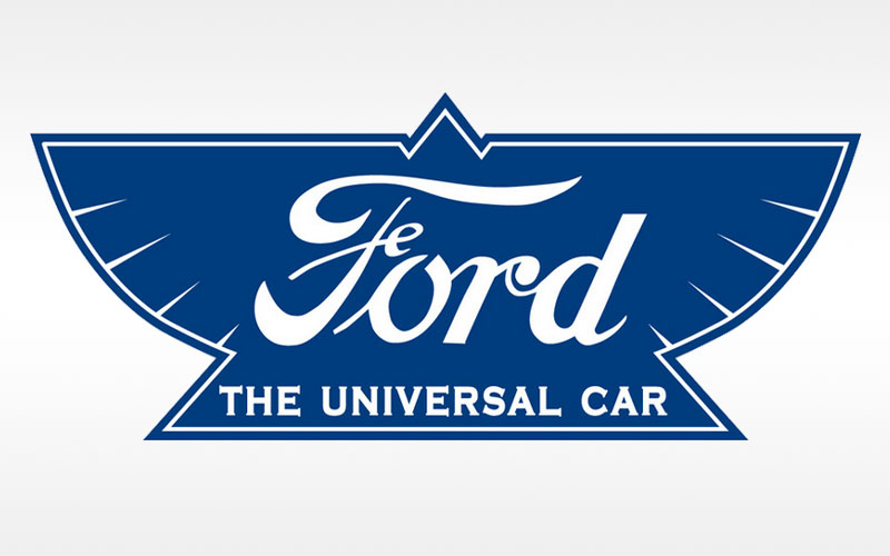
This logo, new in 1912, is among Ford’s most unusual badging efforts. Done in the shape of a bird with a triangular beak, wings, and tail. It also has a newly updated “Ford” signature and a new inscription “The Universal Car” at bottom. Importantly, this is the first Ford logo to be done in blue with white font. This logo coincides with Ford’s implementation of the assembly line, which began in earnest in 1913.
1917-1927

This logo had more staying power, lasting a full ten years of production. It brings back the oval design with a new “Ford” signature in thinner font. Colors return to black and white.
1927-1957

The 1927 logo update is the brand’s most significant as it marks the emergence of the blue oval design. This version has a subtle white frame and retains the same “Ford” signature from the 1917-27 version.
1957-1961

A new logo was introduced in 1957 and marked a period of renewed experimentation in Ford badging. The ’57 design squishes the oval back to closer to the old rhombus shape and updates the “Ford” signature while it keeps the blue and white color combination.
1961-1965

The oval gets another update in 1961, smoother edges and adds a second white border. The “Ford” signature is given a thicker font.
1965-Today

Despite all these different versions, you and I are most familiar with this iteration with its single white frame line and simplified, bolded “Ford” signature.
1976-2003
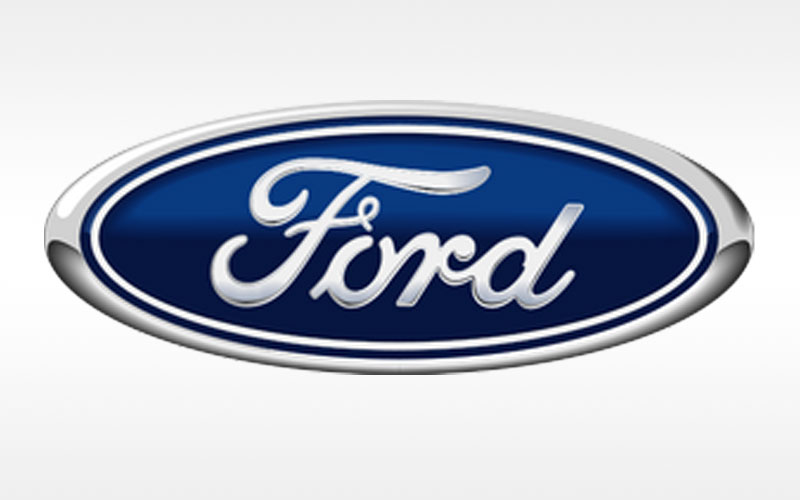
This alternate version of the Ford logo has a darker blue and a metallic frame.
2003-2007

This logo is similar to the standard one except it shades top to bottom in gradients of light to dark blue.
2024 and Beyond
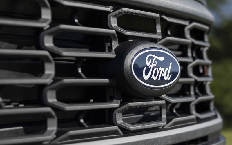
The newest version of the Ford logo recently debuted, unannounced, on the upcoming 2024 model year F-150. The new version deletes the silver outline and blows up the “Ford” signature and changes it from silver to white for a retro feel.


