Latest News
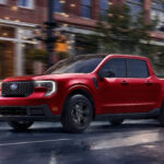
2026 Ford Maverick ReviewJaguar Courts Disaster with Questionable Rebrand
British luxury marque Jaguar attempts a radical rebranding effort as it pivots to full electrification, with questionable results.
The New Jaguar
Jaguar is in the middle of pivoting its brand as the luxury car company transitions from internal combustion to fully electric. As controversial as that switch in propulsion might be, Jaguar’s new rebranding is proving even more divisive. To wit: this week Jaguar unveiled their new logo along with an accompanying 30-second ad featuring all manner of weirdness and no cars, Jaguar or otherwise. The internet has come down hard on Jaguar as a result, calling the ad everything from tone deaf to woke to outright bizarre. So, does this rebranding mark the “end” for Jaguar or a new beginning?
Surely You Jest Jaguar
To understand what’s got Jaguar fans and casual observers so bothered, just watch:
Yeah, it’s a lot. A yellow elevator arrives on pink moonscape and out march a clutch of models, their stoic expressions perfectly contrasting with their flamboyant costuming. They paint, the foist sledgehammers, they look right/left and then straight into the camera interposed on screen with mottos/suggestions for better living, including: “create exuberant,” “live vivid,” and “copy nothing” (most radical of all is the refusal to add -ly to either exuberant or vivid). What the models don’t do is drive or even manage to pose next to a car because, again, there are no cars in the ad. The ad ends with Jaguar’s new brand font which can only be classified as aggressively generic as it evokes nothing of the storied British and is instead reminiscent of the fonts used by Beats headphones, Red Mango frozen yogurt, and the Dune movies.
This wouldn’t be the first time a company has released a new advertisement with the seeming goal of stoking controversy. In the age of viral marketing, breaking into the news cycle is jobs one through three, while making a compelling case for your product comes in a distant fourth. Heck, here in the US we’re used to car ads that lean heavily on theme and atmosphere over actual sheet metal. Saturn even did a spot that intentionally deleted cars in order to sell them.
But this 3D chess interpretation probably gives Jaguar too much credit. In all likelihood, Jaguar’s execs asked the marketing team for a Eurovision-esque rebranding spot, and this was the result. There’s no shortage of irony when Jaguar’s rebranding promises to “break moulds” (British spelling) and “copy nothing” in an ad so generic it could be selling dishwashers or perfume rather than cars.
Hard Lessons in Rebranding

This isn’t to say Jaguar doesn’t need a reboot. The brand has struggled under the ownership of Indian carmaker Tata Motors (since 2008) and before that as a Ford subsidiary. Jaguar’s signature “leaper” hood ornament is certainly long in the tooth and the days are long past when leaning on the brand’s essential Britishness worked to sell cars.
For course, it’s easy to criticize ham-handed attempts at rebranding. It’s much harder to successfully pivot a brand. Failures like Gap’s one week-long rebrand, Best Buy’s phoned-in logo, and most infamously New Coke all illustrate this point. Examples of more successful rebranding like Starbuck’s and McDonald’s featured an incremental approach.

In most cases, the problems with poorly received rebrands fall into three buckets: poor execution, lack of distinction, and radical departures. The new Jaguar logo and accompanying ad suffer from at least the last two. Not only does the new logo and branding take a giant leap (rather than an incremental shift) away from the old Jaguar, but it struggles to create a newly distinctive branding in its place.
Time will tell whether the Jaguar rebrand manages to attract new customers, merely alienate old fans, or both.